Saiga
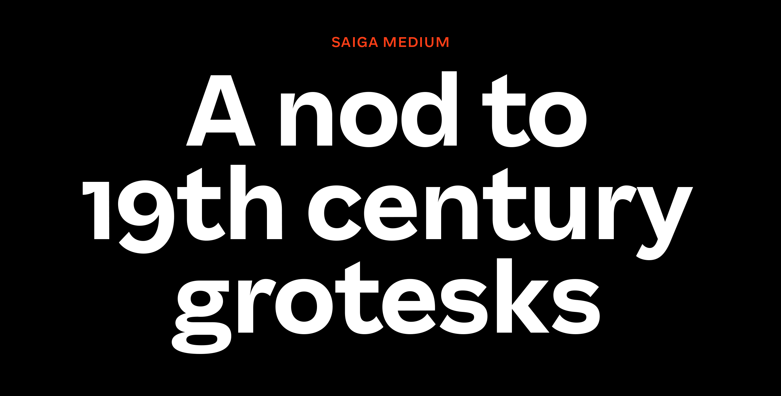
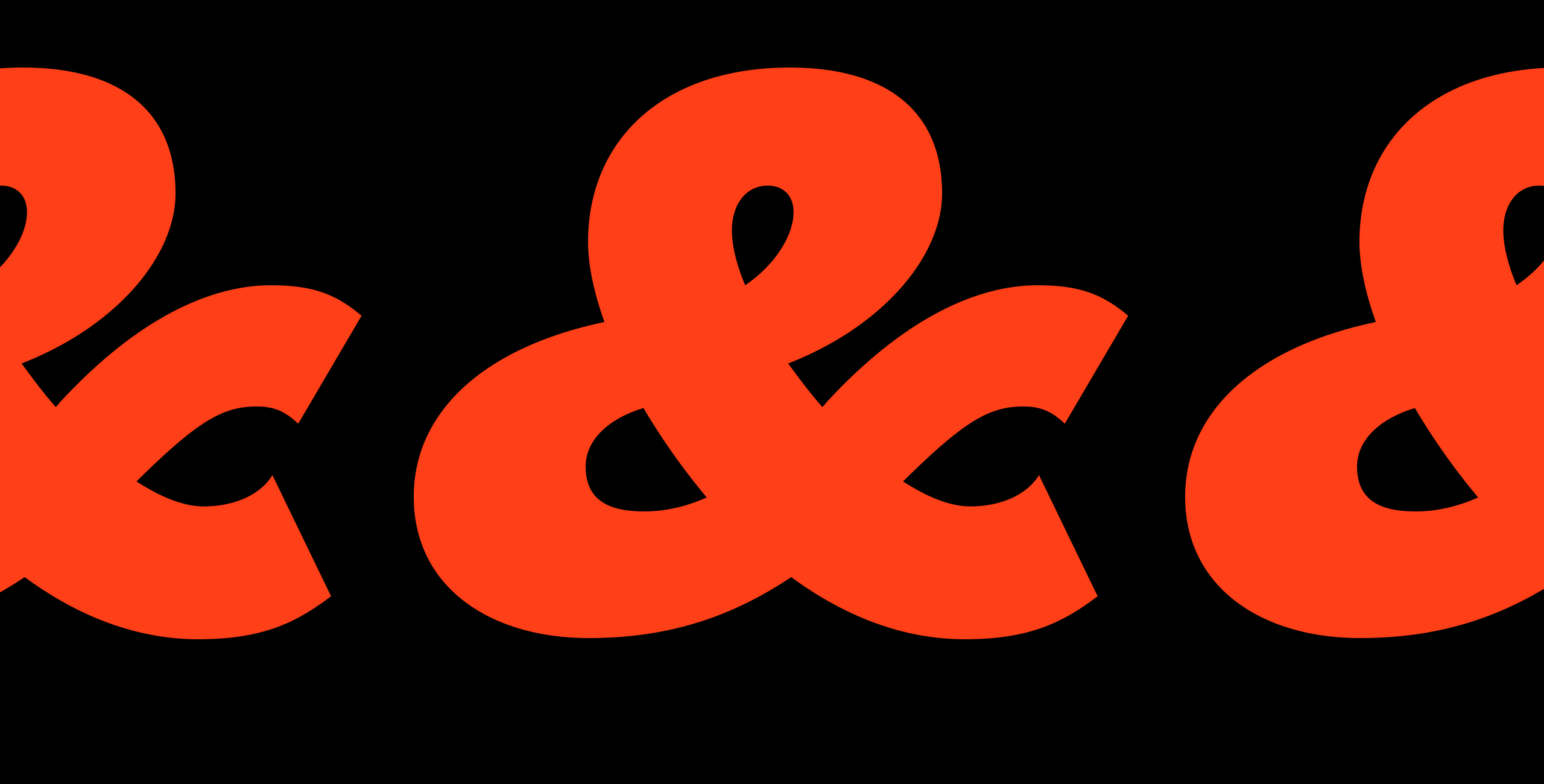
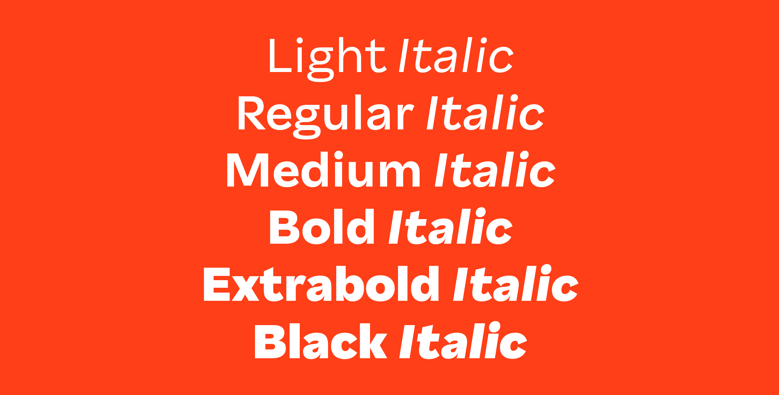
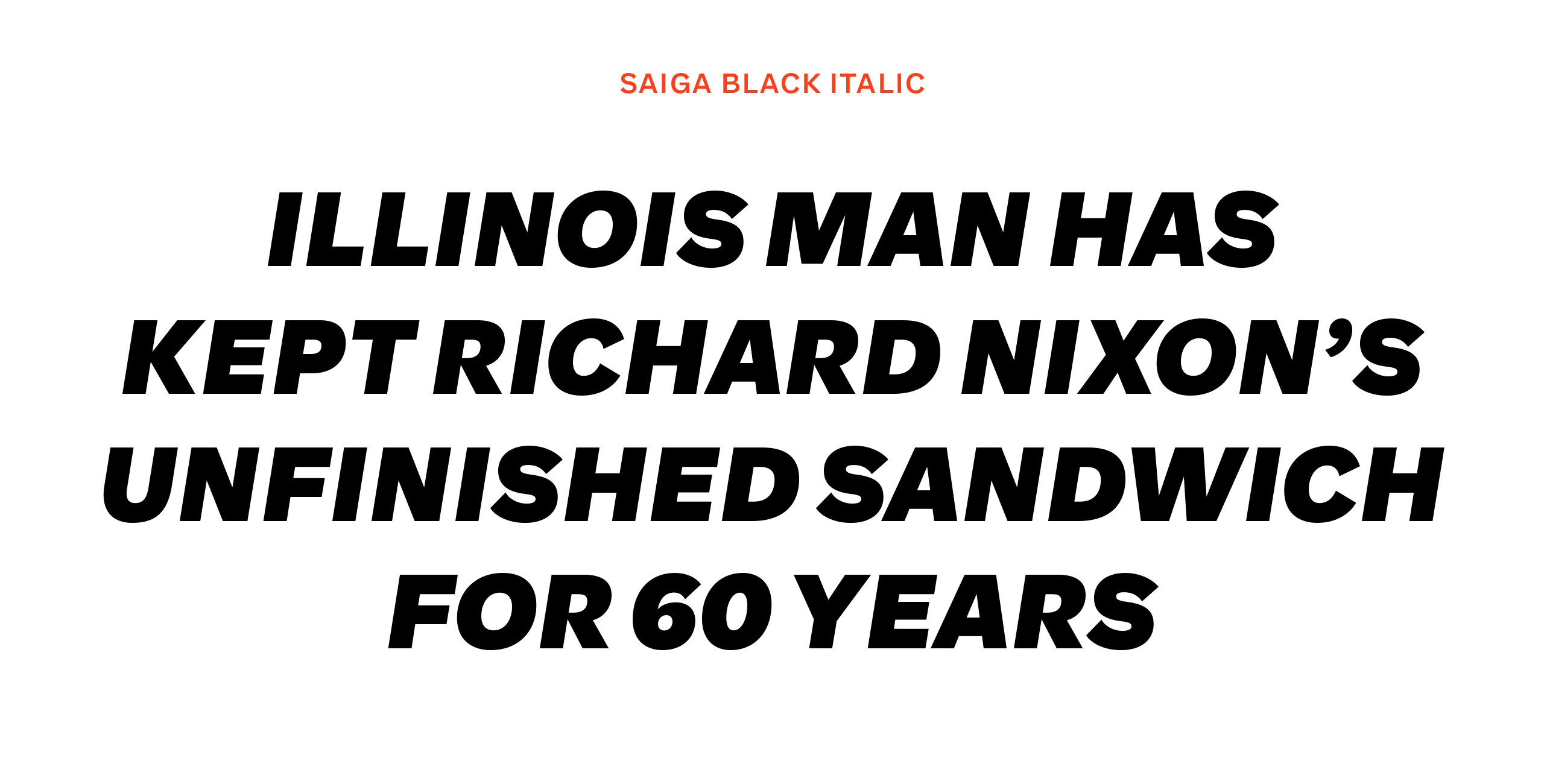
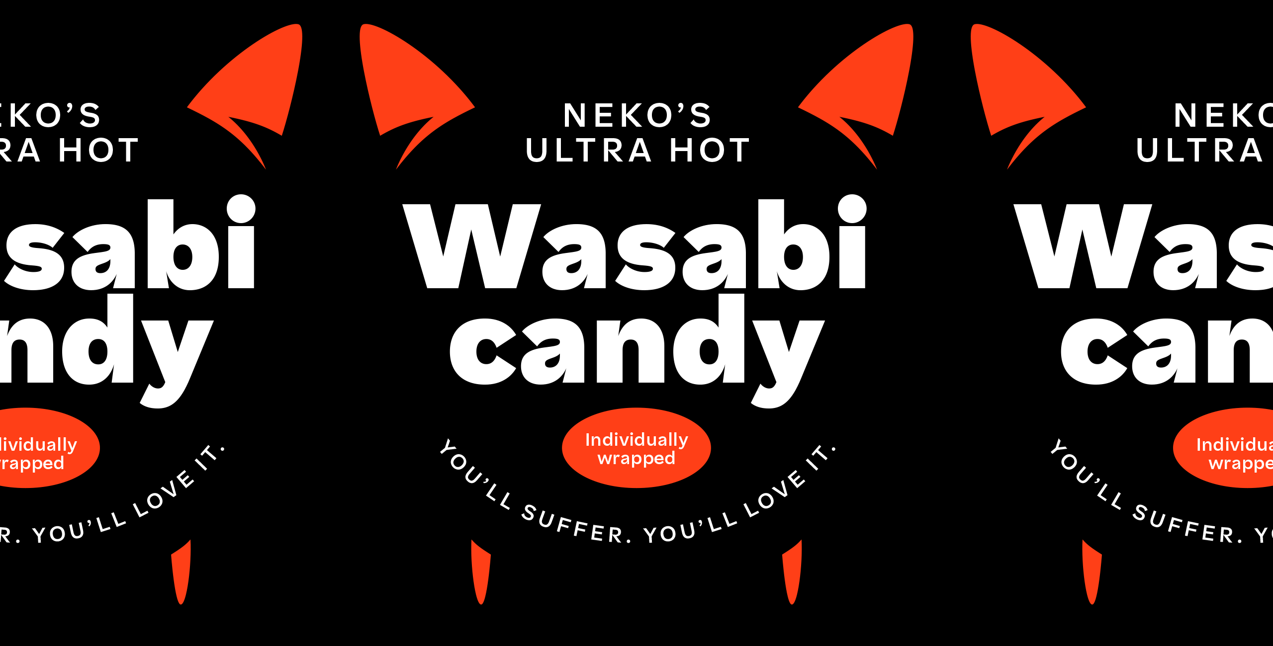
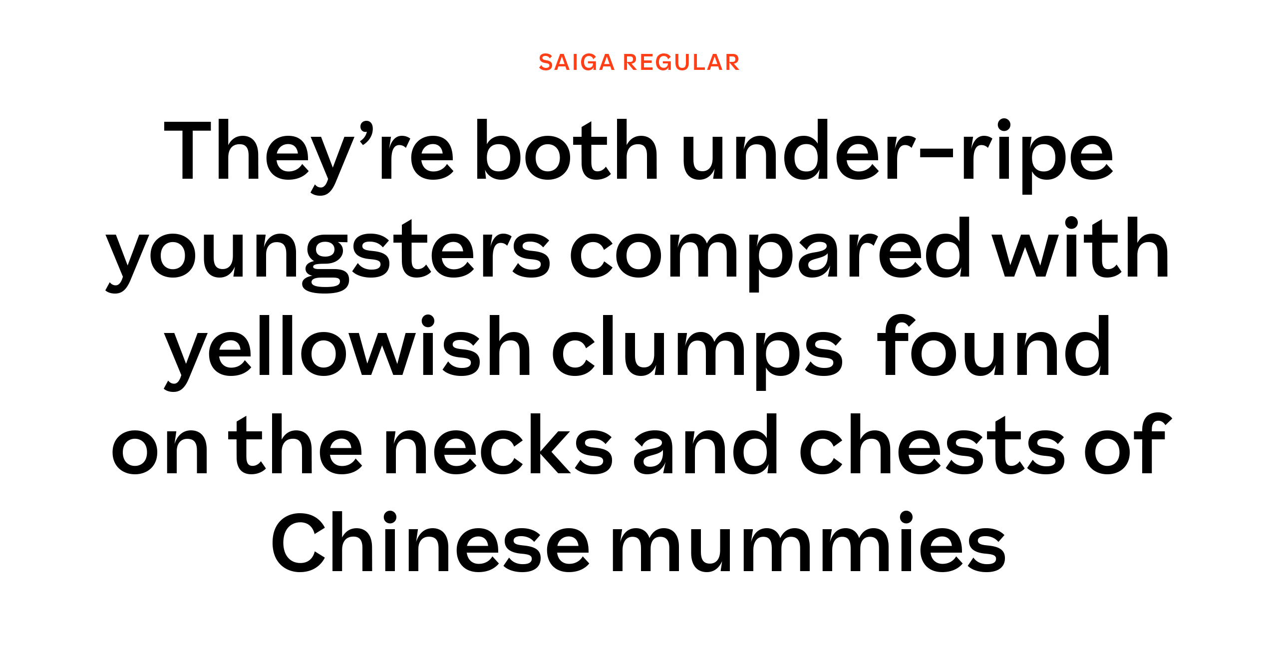
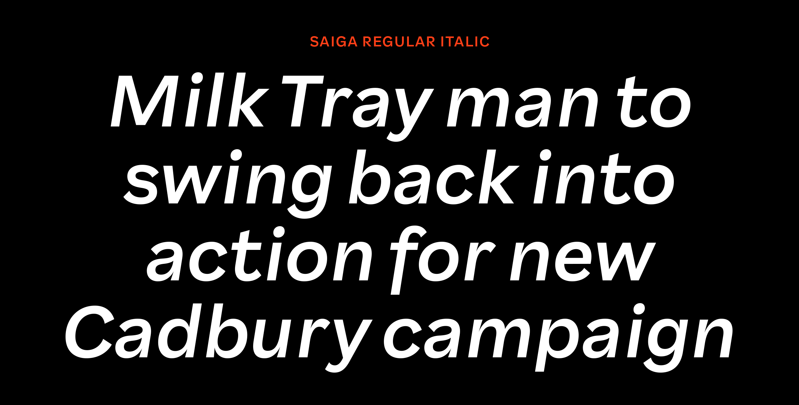
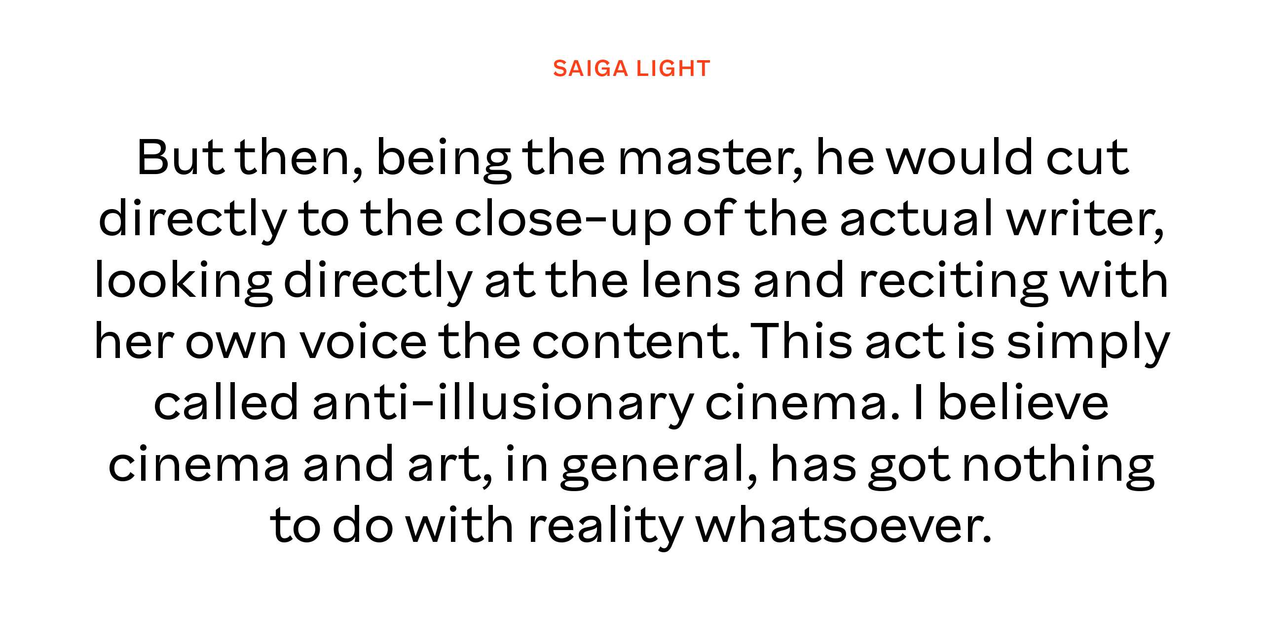
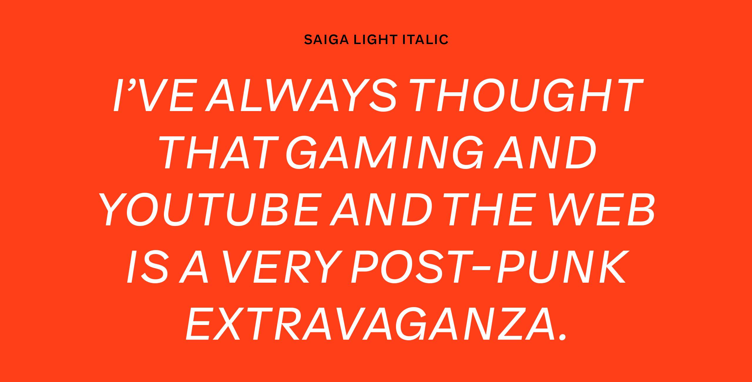
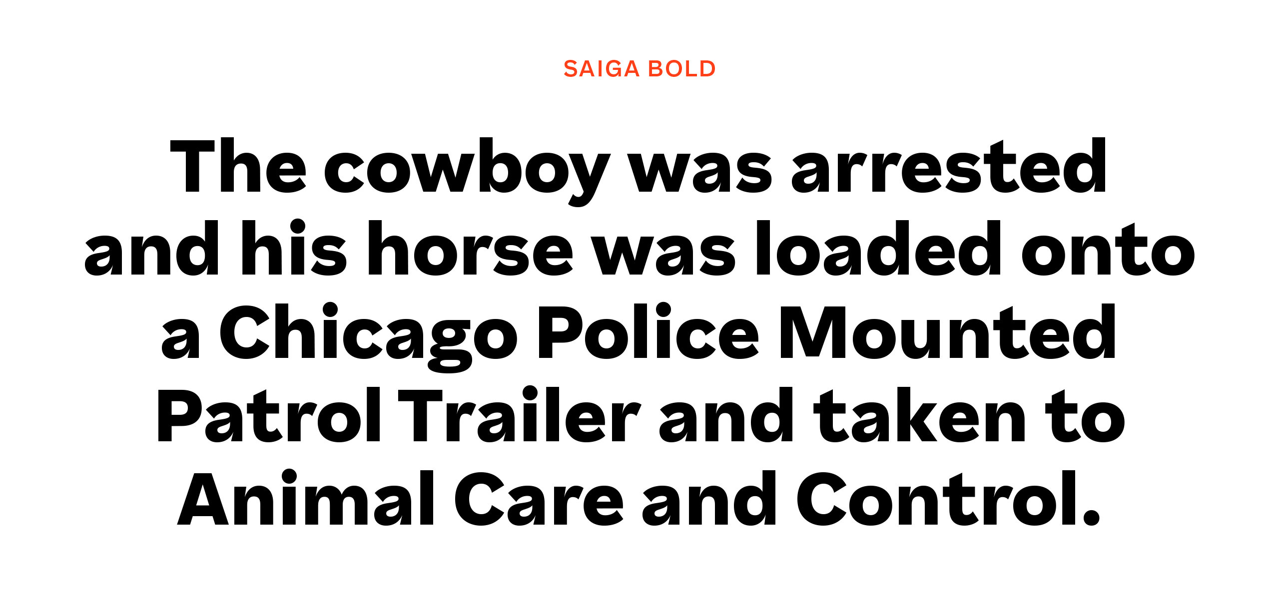
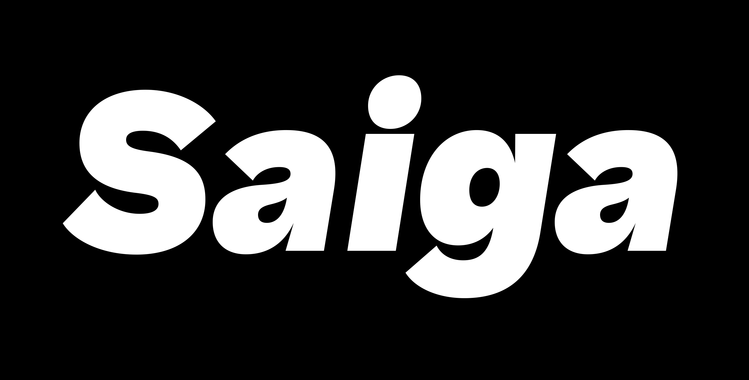
Saiga has its roots in the early grotesk typefaces but brings personal detailing and modern aesthetics into the mix. The terminals have distinct flaring, the curves connect to stems with a flamboyant inktrap and the overall impression has a roundness to it that makes the text feel welcoming and warm. Some idiosyncracies in the lettershapes hint to the source of inspiration which can be seen for example in the swooshing ampersand and question mark. As a nod to tradition the italics are oblique rather than true italics. Together these attributes create a modern grotesk typeface which feels both familiar and new.
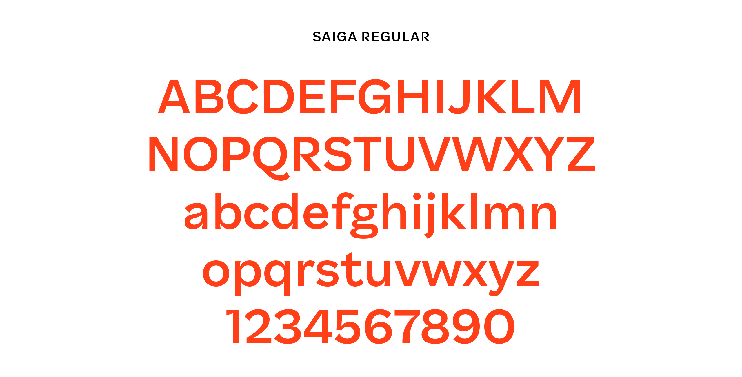
Saiga has six weights ranging from Extralight to Black, with matching italics. All styles have lining-, old style-, and tabular figures, basic fractions, punctuation marks, symbols and Latin Extended language support.
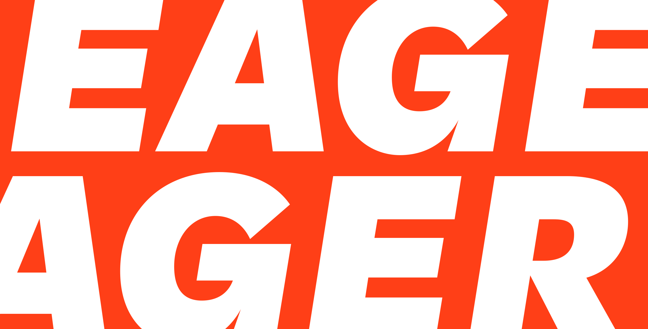
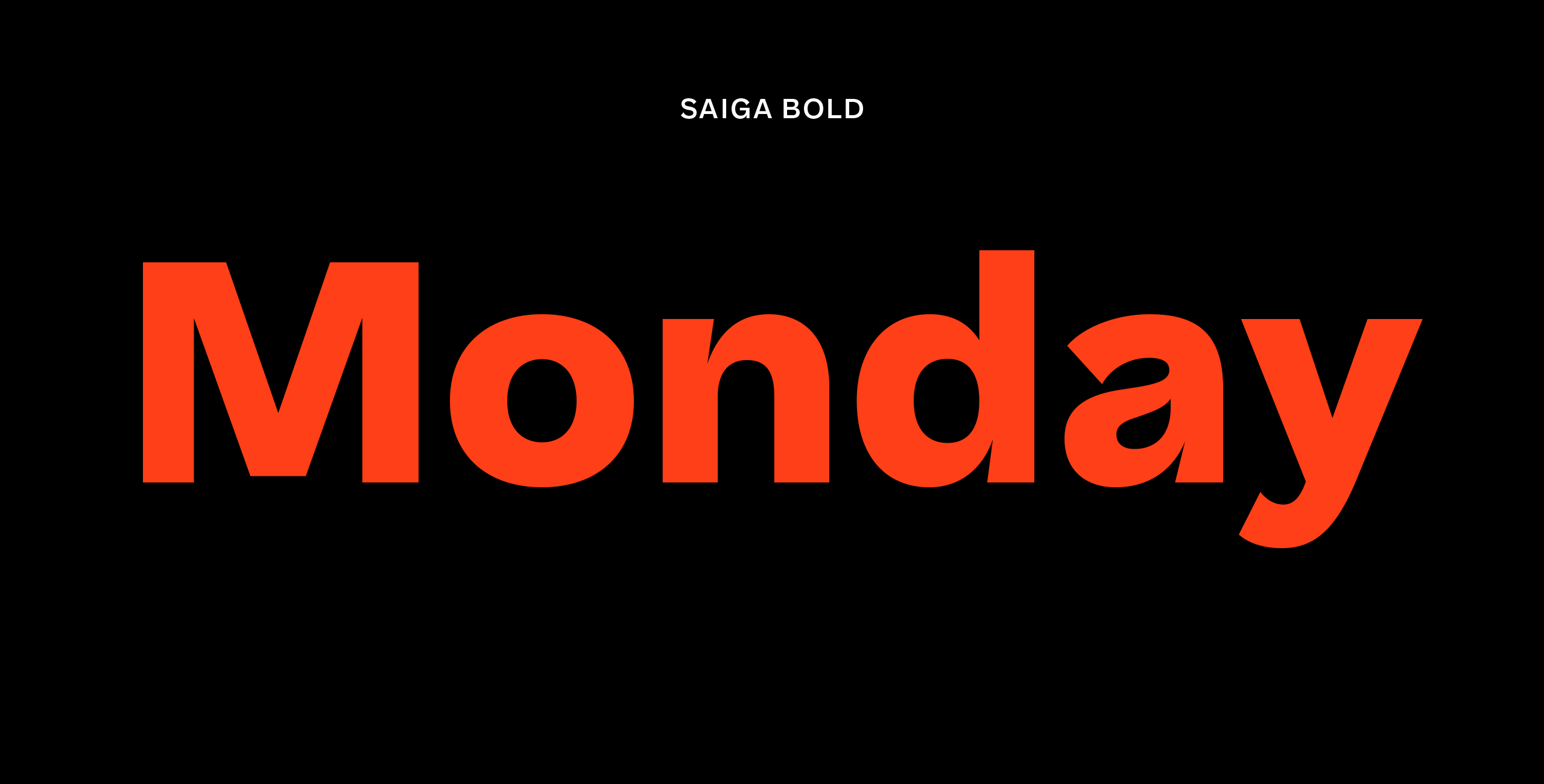
Saiga is a grotesk typeface with exaggerated curves on the terminals. The shapes get more extreme in bolder weights and in the heavy style some terminals actually ovelap with the letter. This sharp shape is repeated in places where a curve meets a straight stem creating an ink trap -like shape. The sharp shapes are contrasted with easy flowing low tension curves. The combination of round and extremely sharp shapes gives Saiga a fresh distinct look in a crowded genre.
Version 0.5 has eight styles in total; Light, Regular, Bold and Heavy with matching italics. All styles have basic characters, lining-, old style-, and tabular figures, fractions, punctuation marks, symbols and Latin Extended language support.
Saiga has its roots in the early grotesk typefaces but brings personal detailing and modern aesthetics into the mix. The terminals have distinct flaring, the curves connect to stems with a flamboyant inktrap and the overall impression has a roundness to it that makes the text feel welcoming and warm. Some idiosyncracies in the lettershapes hint to the source of inspiration which can be seen for example in the swooshing ampersand and question mark. As a nod to tradition the italics are oblique rather than true italics. Together these attributes create a modern grotesk typeface which feels both familiar and new.
Saiga has six weights ranging from Extralight to Black, with matching italics. All styles have lining-, old style-, and tabular figures, basic fractions, punctuation marks, symbols and Latin Extended language support.
CONTACT
teo@teotuominen.com
+358 503005654
CONTACT
teo@teotuominen.com
+358 503005654
CONTACT
teo@teotuominen.com
+358 503005654
CONTACT
teo@teotuominen.com
+358 503005654
SECTIONS
Retail Fonts
Custom Fonts
About
